There’s always going to be some business owner with a horror story along the lines of “Facebook ads don’t work”.
In fact, according to a 2017 study conducted by Weebly, as many as 62% of small business owners feel like their Facebook ads are failing.
The main complaint is that Facebook ads don’t generate enough high-quality leads. What’s worse is that most people don’t know what they’re doing wrong.
They’ve made an advert with an eye-catching image and a strong headline. They’ve built a landing page that clearly lists all the benefits and features of their product/service, and contains a strong call to action (CTA). Yet, when the client follows up with those names, email addresses and telephone numbers, they find the leads aren’t qualified for the sale.
They blame the marketing agency who, in turn, blame Facebook.
There is a myriad of reasons why your Facebook ads may not be working, but Facebook as an advertising platform isn’t one of them. More often than not, it’s something going on beyond Facebook, and beyond the prospect’s initial click.
Hang on, I’ll explain.
Going Beyond Facebook
Your ad is up online, with all the targeting in place. The image you’ve used is one that will generate a lot of interest, and you’ve got a headline between 4 – 13 words. Underneath, you’ve got anything between 18 – 1000 words about your product/service. Most people use 18 – 80.
When the potential customer clicks the CTA (learn more, buy now, etc.), they’re introduced straight to an online form asking for their name and email address. If they scroll down, they may find a couple of testimonials and a short paragraph explaining what the company does and what they’re trying to sell.
And there’s your problem. You’re not giving your prospects enough information, and certainly not enough credit.
It’s kind of like buying a house without taking a look at it first. You’d be making an enormous purchase almost completely blind.
That’s when you need to get creative.
A potential customer typically goes through four stages (and they’re so cliche, I can hear you groaning from here):
Know
Like
Trust
Action
At the Facebook stage, potential leads are just coming to know who you are. Five minutes ago, they weren’t even aware of your existence. And there you are, trying to get them to trust you, bypassing the like stage altogether.
You need to give the customer what they want.
At the Facebook stage, 75% of people are craving more information, not reaching for their wallets.
So, it’s now your chance to educate the public on your product or service. You need to leave your visitors with:
More information than they’ve encountered before (giving them value)
A guarantee that you’re a legitimate company and not another scam
A hunger for your product/service. Once a customer knows your offer and how it can help them, they’ll start to like it. 23% of people will take the required action to take them to the next stage.
For this kind of magic to happen, I always use an advertorial.
What Is An Advertorial?
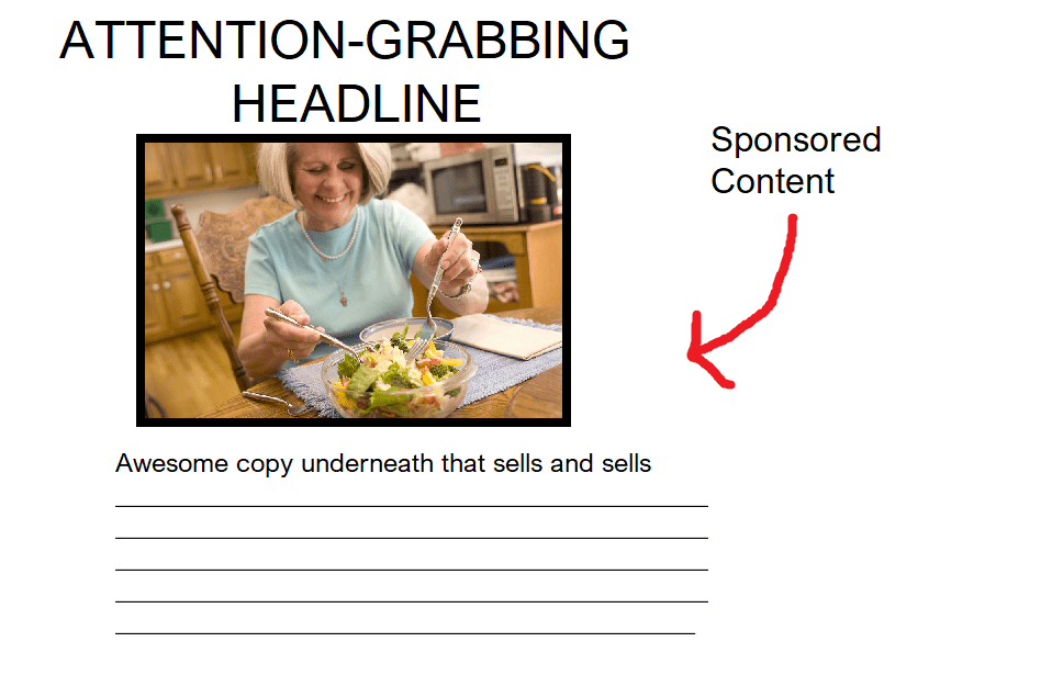
Advertorials are essentially long copy advertisements that provide real value to the reader.
I guess the best way to describe them would be as articles crossed with an ad. The purpose of them is to:
1. Get your audience onside
2. Provide your audience with enough information to learn how to solve their problem/struggle or achieve their dream
3. Get your audience to take a specific action
The aim is to disguise the purpose of your article enough so your audience will read them and not see them as blatant advertising. But, at the same time, you must maintain a degree of transparency because you are, after all, trying to sell something.
A formula to keep in mind for a successful advertorial is:
70% Valuable Content + 30% Product Promotion = A Darn Good Advertorial
So, for an advertorial that works, you have to be in a giving mindset.
People don’t trust blatant ads nowadays. Advertising has spiralled out of control, with the average person bombarded by as many as 10,000 advertisements every single day.
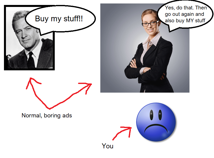
They’re on the television, on your computer, on every single social media platform. They’re on the radio, in your magazines and newspapers, plastered on billboards in the street. The only way to be “safe” from advertising is to become one of those monks who sit all day in a darkened room.
And even then, someone will try to sell them a better robe.
All this “buy, buy, buy!” chanting is exhausting. Advertising is no longer the gateway to a fair transaction: aka, a product in exchange for money 😭😭. It now feels like corporations trying to force you into buying stuff you don’t want, need, or will help you in life (ever seen a Wish ad on Facebook?).
And that’s why advertorials are different. Instead of the “me, me, me” theme that runs through modern advertising, advertorials are focused on “you, you, you” – i.e. the customer and their needs.
The advertorial focuses on the “you” by covering the following:
- Is this your problem? [Headline and hook]
- Here’s what both you and I know about your problem
- And now here’s some empathy about your problem [pain points, get the customer onside]
- Here’s the solution to your problem [gentle introduction to your product/service]
- Finally – here’s what you can do to solve your problem right now [CTA, invitation to take a specific action]
Let’s take a look at an example (there are going to be lots more, don’t worry):
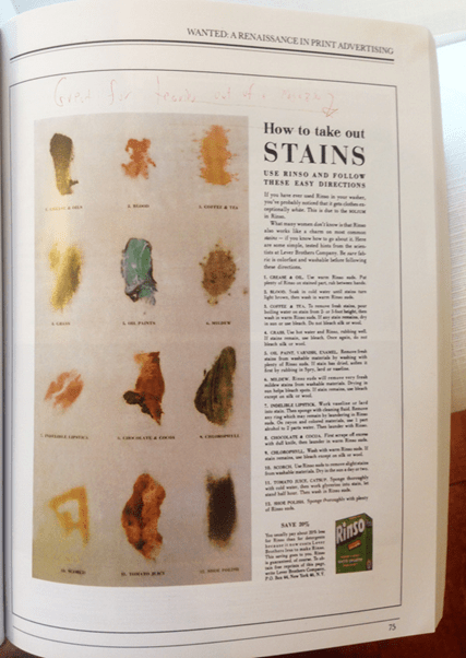
This advertorial was created by the Father or Advertising himself, David Ogilvy. So, let’s break this down together.
Headline: How To Take Out Stains
Why It Works: Stains are a problem for everybody. It’s not something we talk about (unless we really hate parties) but, at some point, everyone has struggled with a stain on a favourite article of clothing.
The magic here is that Olgivy hasn’t said “Rinso makes stains disappear!” or anything as trite as that. “How To Take Out Stains” promises to inform, educate, and solve a problem for the reader.
Subheading: Use Rinso and follow these easy directions
Why It Works: The first mention of the product. This comes a little earlier than in some advertorials, but it’s still masterfully done.
Notice he doesn’t say “buy Rinso”. That would be heading towards “me, me, me” territory. Instead, he places the product in the form of a suggestion and a solution. He didn’t say “Rinso is better than any other detergent on the market” because he didn’t have to.
The Copy and Why It Works: There are so many benefits in a few hundred words of text, it’s amazing.
First of all, Ogilvy starts with “if you’ve ever used Rinso in your wash…”. Again, everything is posed as a suggestion. There’s nothing aggressive, nothing pushing you to “buy now”.
Then Ogilvy goes on to say, “what many women don’t know is…”. Ogilvy isn’t afraid to establish his audience. This was back in the 60s, so most women did the washing. Many copywriters are scared of outright marketing to their target audience, as they think it’ll alienate other groups.
This isn’t true. Sure, laundry may have resonated the most with women, but single men would have been in charge of washing their own clothes.
Bottom line: don’t shy away from clearly stating your target.
“Here are some simple, tested hints from the scientists at Lever Brothers Company”. Less than 100 words in, Ogilvy hits his audience with some proof. This isn’t just another ad, this is the result of a professional experiment. Suddenly, this “magic washing powder” has some credible proof that it works.
For the next few hundred words, the article lists stubborn stains, like blood and chocolate. Each stain, which you can see in the advertorial’s picture on the left, has a tailored solution by Rinso and the scientists at the Lever Brothers Company.
This is why Ogilvy’s advertorial did better than any other detergent ad that came before. It offered the audience real value, instead of hitting them with a massive sales pitch. Thousands of women tore out that page from their magazines to keep in their laundry rooms. And what would they be reminded of every time they referred to the sheet? That’s right: Rinso.
As a final plug, Ogilvy says:
“Save 20%. You’ll usually pay about 20% less for Rinso than for detergents because it now costs Lever Brothers less to make Rinso.”
So far, Ogilvy has written about Rinso’s features. It’s a detergent that gets rid of tough stains. Great, but that’s why people buy detergent. However, Rinso also comes with a benefit: it’s the best of the best, and it saves you money. This is value layered on top of value, and it’s extremely seductive to the customer.
So, now you know what an advertorial is, let’s go onto the next stage.
How To Build An Advertorial
So, now we know five things:
- 75% of audiences want more information after they’ve clicked on a Facebook ad
- They know about your brand and need information to transfer to like
- They’re not ready for a hardcore sales pitch
- The more value you give to your audience, at this point, the better
- Your audience needs to be gently guided towards taking a specific action.
And GO.
Haha, just kidding.
To build a successful advertorial, you’ll need to really dig deep into your ideal customer’s head.
A few posts back, I showed you how to build a customer avatar and an empathy map. Let’s take a look at those again.
Customer Avatar
![]()
As I said before, customer avatars are less “these are the people I want to aim my ads at, I think” and more “mapping out a character for your new fiction novel”. Customer avatars are specific.
Here’s what you need to think about when you create a customer avatar:
- Gender
- Age
- Location
- Income
- Education
- Occupation
- Interests
- Online Behaviours
- Goals
- Pain points and struggles
- Shopping habits
Now start thinking about how to apply those points in your writing.
Gender

How will the gender of your ideal customer affect your writing style?
Remember, studies on male and female linguistics show that people with a “male” brain speak the language of status and independence, while people with a “female” brain talk about connection and intimacy.
Female readers are more likely to respond well to the following:
- Hedges – phrases like “I mean”, “I think”, “sort of”
- “Empty” adjectives – “cute”, “lovely”, “wonderful”, “divine”
- Precise colour terms – “cyan” rather than “blue”, “magenta” rather than “pink”, “sage” rather than “green”
- Intensifiers – “so”, “just”, “very” and “really”
- Tag questions – “isn’t it?”, “aren’t you?”, “don’t you agree?”
Age
The language of pensioners is very different from the language of teens. Or is it?
Interestingly, studies show that those under 30 and those over 50 use a high amount of vernacular speech (the language or dialect spoken by ordinary people in a country or region).
Meanwhile, those who fall in the 30-50 bracket use language more associated with professionalism and “correctness”.
Studies also show that adolescents use slang more than adult women (18+), but less than adult men (18+). However, the slang used by people aged 30+ is more likely to be “outdated” than the slang used by those aged 30 or under.
Location
Probably not the best idea to write your advertorial in cockney rhyming slang, but using location in an advertorial can have a powerful effect.
Using my earlier example: “Millions of Londoners are astounded by these plummeting car insurance rates”.
Just by inserting a location, you’ve transformed a blanket offer into a personalised offer.
If appropriate, you could also refer to the landmarks of a location within your advertorial. This gives your advertorial a sense of trustworthiness – you know what you’re talking about and who you’re targeting. This isn’t just another “publish and pray” advert.
Income
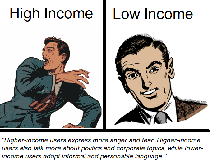
How much money your ideal customer makes will influence their buying decisions.
In regards to income and language use, a 2015 study from Plos One found that:
“Automatic analysis of language use uncovered that higher-income users express more anger and fear. Higher-income users also talk more about politics and corporate topics, while lower-income users adopt informal and personable language.”
Education
There are multiple exceptions, but higher education often correlates with higher income.
Understanding your ideal customer’s education level will also help you communicate effectively via an advertorial. The average reading age in the UK is 11, and the most popular UK newspaper is The Sun, which has a reading age of 8.
Essentially, if your advertorial is too difficult to read, you’re going to lose a lot of your audience. I would say that simple is always best. A highly educated person may be able to read long sentences and difficult words, but they won’t necessarily be engaged.
There are some useful readability tools on the internet, like this free one here: https://www.webfx.com/tools/read-able/check.php
Just click “Test By Direct Input” then copy and paste your text into the box. Your “Test Results” will reveal the reading age of your text, and give you a Flesch Kincaid Reading score. This measures the readability of your text, will 100 being “pre-school level”.
An acceptable Flesch Kincaid score for online content is between 60-70.
Occupation
This ties into income and education (but, again, not always with the latter).
To go back to Ogilvy’s Rinso example, he absolutely nailed talking to busy housewives. There isn’t too much text, and the picture helps to identify various stains quickly. A majority of the writing was short, sharp instructions and not much “fluff”.
Whatever jobs they have, people in the 21st century are busy, busy, busy. An advertorial should boast a wealth of information, but don’t take thousands of words to do it. You’ll end up boring people, when all they needed was enough information to be persuaded to take that next step.
When it comes to occupation examples, such as “nurse” or “lawyer”, style should be common sense. With lower-income occupations, keep the style informal and try not to use too much jargon or technical language.
Pain Points and Struggles
You can’t market to your ideal customer until you know what their problems and their needs are. Then, from there, you need to work out how your product or service provides a solution.
Pressing on your customer’s pain points can make some wicked content. In Robert Cialdini’s book “Influence: The Psychology of Persuasion”, he tells us about a study conducted with two slightly different adverts sent to homeowners in the same neighbourhood.
The first ad said: “If you insulate your home fully, you’ll save 50 cents a day.”
The second ad said: “If you don’t insulate your home fully, you’ll lose 50 cents a day.”
The people who received the second ad were 150x more likely to insulate their homes.
This study shows us that people are more motivated by the fear of loss than the hope of gain. Avoiding pain is more important to our survival than gaining pleasure.
So, the trick with an advertorial is to spend some time massaging the ideal customer’s biggest pain point. You’ll need to remind them of their pain, and get them worked up into a frenzy. What could have been a relatively small problem is now a big issue they need to solve.
And once you’ve got them worked up, that’s when you start to offer them value through information, followed by a solution. Mentioning problems A) gives the reader context and B) gives you the valuable opportunity to show empathy for your customers. If the customer believes you truly care about them, they’ll engage with you.
The Empathy Map
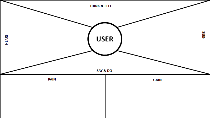
You’ve combed through your customer avatar and thought about how to apply that knowledge to a long piece of advertising content. Now, do the same with your empathy map.
As I said in a previous post, avatars work out the habits and features of your ideal customer, while an empathy map focuses on customer mindset.
Let’s take “Think and Feel” as a jumping-off point:
Think and Feel
- What keeps your target awake at night, indigestion boiling up their oesophagus, eyes open, staring at the ceiling?
- What are they angry about? Who are they angry at?
- What are their beliefs and dreams?
- What makes them sad and scared?
- Is there a built-in bias to the way they make their decisions? (example: engineers = exceptionally analytical)
Go through each of those questions and their answers one by one and think about how you can apply them to long-form, persuasive content.
The last question is particularly important for your advertorial’s style: “is there a built-in bias to the way they make their decisions?”.
If your ideal customer is analytical, your advertorial will need to be littered with (genuine) facts and statistics. Emotion plays a part, but this type of customer uses their head, not their heart.
With this kind of person, use bullet points and avoid long, winding sentences. Any doubts they may have, allay them with testimonials, quotes from professionals and hard evidence.
For the “emotional” ideal customer, they will respond better to a story. Not “once upon a time…” but a short, valid account of someone who suffered the same and defeated the odds. Make the language informal and personable. Analytical people want to be pointed towards the next step, while emotional customers want to be inspired into embarking on their journey.
Hooks
So, you’ve looked over your customer avatar and empathy map. You’ve now got some ideas on how to form a persuasive, valuable article that’ll speak directly to the reader.
But before you dive in and start writing, you need to come up with a hook.
If you don’t know, a hook is often a single phrase or sentence that describes an offer’s main benefit.
That said, a hook isn’t the whole offer. It’s more of a sample – enough to tease the reader and make them hungry for more. When customers take the hook, they’re encouraging you to follow up and market more to them. A memorable hook attracts attention to you, your message and your business.
Hooks should:
- Announce more information
- Be surprising. Catching a prospect off-guard gets their attention
- Be exclamatory or emotional
- Promise a benefit or a solution
Get the hook right, and the probability of converting a “browsing prospect” into a “paying customer” increases significantly.
It won’t surprise you that hooks are difficult to come up with. You may find yourself writing 20, 30 or even 40 before you’re happy with one.
When I’m trying to come up with a sales hook, I keep these three things in mind:
Inevitability
Intrigue
Promise/Solution
Sound like a lot to fit into a sentence or so? Here’s a good example:
In February 2018, DashThis, an agency reporting software company, asked Facebook: “What’s the difference between DashThis and a regular old spreadsheet?”
DashThis’ service isn’t one you’d call “exciting”. However, they managed to take something dull (a spreadsheet) and suggested that their product is more exciting than the original object. In the space of a question, DashThis tapped into three selling points:
- Inevitability: Spreadsheets are a part of life
- Intrigue: Our automated spreadsheets are different – find out why!
- Promise/Solution: By being different, our product is better. This could be the solution to your “boring spreadsheet” problem.
There’s so much subtext you can stuff into one sentence. It doesn’t need to be in the form of a question. Last year, PPC Manager, Graham Connolly, wrote the following hook for a debt service: “How mums are writing 75% off their debt”.
After clearly defining his audience (mums), he tapped into the same three selling points:
- Inevitability: People get into debt and have to pay it back
- Intrigue: How did these mums get so much debt written off?
- Promise/Solution: Read the article, and you can do the same
In just a few words, you’ve caught the reader’s attention enough reel them in and keep them reading.
Here’s another example, this time from a car finance company:
“Car Finance With No Deposit”.
Straight to the point, right?
Why is their hook intriguing?
Car finance is pretty simple. The more you borrow, the more you’ll owe. Usually, there’s a hefty APR added to the mix. On top of that, many car finance companies expect you to put down a deposit. Simple, yet genius, the promise of no deposit is enough to lure customers in.
What pain point does it hit on?
Borrowing money is necessary, but it’s a pain in the ass – especially when it’ll take years to pay off. One missed payment can lead to fines, increased APR, or worse. A hefty deposit on top of all the repayments can send you into a financial tailspin – it may prevent you from getting a new vehicle altogether. Do the risks outweigh the benefits?
What solution does it offer?
The hook indirectly promises to save the customer money. Or, if they don’t save money due to APR, the customer at least won’t have to pay a large sum of money upfront.
Is it clear and precise?
At only five words, the hook couldn’t be clearer.
What action does it prompt you to take?
Look at the landing page, make enquiries. A no-deposit deal catches attention far more than the usual “cheap rates”. It doesn’t ask you to make a commitment outright either – there’s no “limited time” framework, so you can do your research and make a decision at your own pace.
Remember – when it comes to an advertorial, your hook should run through the entirety of the article. Every paragraph should lead up to, or be inspired by, your hook. That’s what reeled the audience in initially, and it’s the centrepiece of your project.
All the valuable information you give in an advertorial feeds the desire to grab hold of the hook, like a fish nibbling on a bait.
The Science Of An Advertorial
By now you:
- Know your customer inside and out
- Have worked out how your customer’s traits will influence your writing style
- Have found the hook that inspires the entire advertorial
That’s a great start. Now I’ll walk you through the key features of the best advertorials and why they work.
Write Like The Publication You Want To Sound Like
Most “How To Write An Advertorial” posts tell you to write like the publication you’ll appear in.
For example, if your advertorial were to appear in the Daily Mail, you’d need to write for a “middle-market” audience – people who want a mixture of real news and entertainment.
The Guardian is more high-brow, Take A Break magazine is sensationalist, Buzzfeed would reference pop culture, with a heavy dose of memes, listicles and gifs.
This is great advice. The more the tone matches that of the publication, the more seamless the transfer from the publisher’s content to your advertorial.
However, your advertorial is most likely attached to a client’s website, having come from a Facebook advertisement. It’s highly unlikely you’d have it in a popular online newspaper, or an internet media site like Buzzfeed.
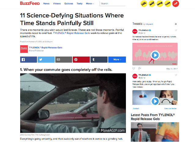
That said, don’t skip over this step. Study your client’s website and try to get a feel for the writing style. If your advertorial’s tone differs too drastically from the company website, people will write you off as an untrustworthy source.
Or you can buy a domain and have all your advertorials (within the same niche) on a lead generation website.
Flexx Digital owns such a site called Money Tips Feed. The premise is simple – “Money advice, where it counts”.
Rationally, you know that money advice is going to be dispensed in a certain kind of style and tone. I.e., you’d write in an article about money advice in a different style than you would, say, party planning.
To get an idea of the style and tone you should use, you should check out your competition. Just by Googling your vertical, you’ll come out with a tonne of useful information. Take screenshots, make notes. Put all of your findings into a Google doc and make the best articles into a swipe file.
Then, take an article similar to the one you want to write, and ask yourself the following questions:
Copy
- What’s the headline? How does that help draw customers in?
- What tone are they using?
- Is everything written with perfect grammar, or is the style a little more casual?
- Does the content appeal to emotion? Or does it rely more on facts and features?
- What story can you take from the copy? (Everything has some sort of narrative, even a list of bullet points).
- Delve deeper. How does your competitor use customer psychology to their advantage?
- What HAVEN’T your competitor’s said? Why is that more important than what they HAVE said?
- Any testimonials or reviews? How will they impact the visitor?
Layout and format
- What images do your competitors use? How many?
- What’s the colour scheme? How does colour impact the visitor’s buying choices?
- What fonts do your competitors use? TIP: If you can’t name a font just by looking at it on the page (and hardly anyone can), I highly recommend downloading Fontface Ninja. It’s a FREE extension that lets you inspect, try, buy and bookmark the fonts that appear on any website. How would different font styles subconsciously affect the reader?
This practice is called reverse-engineering, and it’s an incredibly valuable exercise if you need to do something new without much knowledge.
Let The Headlines Do The Hard Work.
Just as you did with the Facebook ad, you’ll need to sit down and think hard about your headline. Your goal is to make the advertorial look like an article or feature, so leave any elaborate wordplay out of the mix.
That’s not to say the headline shouldn’t be clever. It needs to be interesting, compelling and unexpected. In November 2013, The Tulsa World, a newspaper distributed in Oklahoma, released an article with the following headline and subheading:
Headline: Public lines up for new low-cost appliance that slashes heat bills
Subheading: Amish craftsmen vow to keep up with rush for brand-new Hybrid-Thermic ‘Miracle Heater’ that uses about the same energy as a coffee-maker per hour, so just plug it in and never be cold again
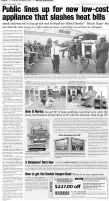
Ouch. This advertorial had gone to great lengths to look like a genuine news article, with a large photograph of people queuing outside Sears, an American department store. However, a headline that proclaims “slashes heat bills” may as well have #UlteriorMotive!!! written next to it.
The “…so plug it in and never be cold again” has been lazily crowbarred into the subheading, essentially giving away the entire point of the article before the prospect has had a chance to read it. That’s 500 wasted, ineffective words.
Like any good sales strategy, your headline needs to generate a thirst to find out more and keep the prospect reading.
One advertorial that still creates excitement among marketers is John Caple’s US School of Music advertisement, written in 1926. Developed during Caple’s first year at Ruthrauff & Ryan, the headline reads:
“They Laughed When I Sat Down At the Piano… But When I Started to Play!~”
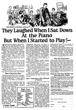
As a headline, it worked brilliantly. There’s no hard-sell or overload of information. Instead, the success lies in the emotion it stirs within the reader. From a few words, we can tell this is a classic “underdog reaches the spotlight” story, and we want to know how and why it happened.
The body of the copy is written like short fiction, from “Jack’s” point of view. He explains how he sat down at the piano at a party, only to be mocked by his friends and acquaintances, who knew he’d never played the piano in his life. After a flawless rendition of the Moonlight Sonata, however, the other guests burst into “a sudden roar of applause”.
The story then filters down to its call-to-action, promising the US School of Music’s ability to teach anyone how to play any instrument in only a few months. Which brings me to…
Relate Your Message To Real Life.
Another reason Caple’s advertorial did so well is that he bought a relatable character to the page, Jack. In only a few hundred words, Jack’s entire personality was brought forward to an audience of thousands. He’s a charming, easy-going “everyman”; a bit of a clown, the guy everyone underestimates… until he reveals his hidden talents. Everybody sees themselves in Jack and will be keen to emulate his success.
See, it all comes down to the difference between pointing out a feature and a benefit.
A feature is what your product or service does. Taking a real example from my own ad campaigns in Flexx Digital, let’s look at the debt advice service, Aunt Meg.
Aunt Meg’s features are that the service will offer you a government-approved way of getting out of debt without declaring bankruptcy. This is usually via an Individual Voluntary Arrangement (IVA) which lets you pay off your debt in instalments. If the debt isn’t paid off by the time the IVA ends (typically after 60 months), you could end up writing off a portion of your debt.
Though this explanation is A) factually correct and B) what the customer is ultimately looking for, there are hundreds of services that provide exactly the same features.
Features = The Stuff You Pay For
Benefits = The Joys That Stuff You Pay For Brings
What we need to do, then, is to relate our message to real life and point out all the benefits. This will put us ahead of other debt advice companies, as we’ll be humanising the service and speaking directly to the customer.
A benefit is something of value and usefulness. It takes the feature and explains why it’ll be useful for you, as a human being. By describing the benefits, you’re offering a solution to a customer’s needs, wants, and fears.
Going back to Aunt Meg, it’s pretty easy to see what the benefits are from looking at the website, www.auntmeg.com. Aunt Meg is a character branded as “your financial fairy godmother with attitude”, meaning she’ll offer the customer “no-nonsense” advice and a solution to a life imprisoned by debt.
Aimed primarily at mothers, the first paragraph on the landing page reads: “Aunt Meg helps mums sort out their debts. Leaving time for you to relish in the important stuff – your kids.” Instead of going for an IVA hard-sell, Aunt Meg takes a very human situation and tackles the emotions borne from it.
Being in debt can be stressful and time-consuming. You may be so worried about paying bills and keeping the bailiffs from your door, you don’t have the energy or emotional capacity to focus on your children. Aunt Meg can help with your debts and give you back the life you deserve.
For a successful advertorial, you need to talk about why the benefits of a product or service are significant, what they can do to help, and how they will change the customer’s life for the better.
If you’re having trouble thinking of the benefits of your product/service, here’s a tip I learned from Dave Dee, a key figure in sales training. List a feature, followed by the clause “which is useful because”, then add the benefit. For example:
This post contains instructions on how to write an advertorial which is useful because you’ll be able to build a high-converting funnel, ensuring great quality leads and a better ROI.
Focus On One Thing Only
I’ve seen advertorials try to juggle so many different points, they lose sight of their hook and purpose altogether.
It’s easy to confuse a tangent with a “necessary detail”. Before you publish your advertorial, let someone else read it. Fresh eyes will tell you whether something is vital or unnecessary.
Use Images, Photos and Quotes
Even if your advertorial is beautifully written, there’s nothing more boring than a huge block of text. Use pictures to break up the wall of writing, and make sure they’re relevant to your service or product. Remember, an image can set the tone as much as writing style – so don’t use a meme if your content is written like a newspaper article.

Quotes are also a great way to grab a reader’s attention. You can use testimonials, opinions, or facts. Quotes will lend your product or service a sense of authenticity, which could be the difference between your customer choosing to buy or looking elsewhere.
Use A Subtle Call-To-Action.
If the main body of the copy is valuable information and empathy for the reader, then your CTA should ensure you don’t ruin what you’ve spent so long setting up.
Be careful not to switch from an editorial style into hard-hitting business-speak. This will disconcert the reader and may cause them to drop out. Subtly weave in the name of your product or service throughout the article, and plant the seed that will result in a sale.
At the very end, tell your readers what to do and where they need to go. This will increase the chance of converting a prospect into a lead by 70%.
Summary
Advertorials can take some time and practice to perfect, but a good advertorial will reap the rewards.
Remember that the key focus of an advertorial is to give information and value to a reader, not hit them with another sales pitch. Print out the following equation and stick it on your wall:
70% Valuable Content + 30% Product Promotion = A Darn Good Advertorial

