Crafting a high converting landing page doesn’t have any hard and fast, one-size-fits-all rules.
However, the best landing pages on the net do have some similar characteristics.
In today’s post, I’m going to dig into some tips and tricks on how to make a high converting landing page and, in the process, boost your ROI.
What Is A High Converting Landing Page?
It really depends on the industry. A quick look a WordStream will tell you that a high converting landing page has a 2% to 5% average (although the traffic source is unknown).
However, at FlexxDigital, it’s not uncommon for us to see a 27% conversion rate. As a rule of thumb, a good page for us converts between 20% to 40%.
We don’t do anything magical. Instead, we stick to these simple guidelines to make our pages as user-friendly as possible.
1. For A High Converting Landing Page, Keep Information Above The Fold

When it comes to a high converting landing page, layout optimisation is everything.
“Above the fold” is an old journalistic term for the layout of a newspaper. All the breaking news would be at the top of the front page – “above the fold” of the less critical news underneath.
The phrase “above the fold” has stuck now we’ve transferred over to web design. Today, the term refers to the bottom of a browser window, 600 pixels from the top of the page (Optimizely).
So, the first thing a user will see when they reach your landing page is whatever’s “above the fold”. This should be the content that’s the most important to achieving your goals. If you’re generating leads, this should be the form or quiz that gathers the prospect’s details.
As soon as the user has to scroll to find what they need, you’ve already lost some conversions. Don’t overload the page with information – the user should be ready to go based on your ad.
No links, no “alternative offers”. If you’ve got anything that’s a potential distraction or takes the prospect off-page, you can say goodbye to a portion of your conversion percentage.
2. List The Benefits And Features For More Conversions
To give your conversion rate that extra boost, list the benefits and features next to the form.
You need to repeatedly remind the audience why YOU’RE the only solution to their problem. A quick, bullet-pointed list will remind them of the key benefits that come with your service.
If you’re having trouble distinguishing your benefits and features, here’s a quick formula I learned from Dave Dee, a key figure in sales training.
- List your feature
- Add the clause “which is useful because”
- List the benefit
- Break down the sentence into bullet points
E.g.
This post tells you how to build a high-converting landing page which is useful because you’ll generate more high-quality leads and boost your ROI.
- Learn how to build high converting landing pages (feature)
- Generate more high-quality leads (benefit)
- Skyrocket your ROI (benefit)
3. A High Converting Landing Page Looks Great On Mobile
So many people forget about this, especially when they’re starting out.
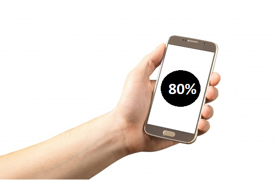
If you’re running ads on the Facebook platform, 80%+ of the traffic you’ll get will be from mobile. This makes the mobile layout four or five times more important than what the landing page looks like on a desktop.
The same applies as what I said in the “above the fold” section. Make sure your form, heading and benefits are at the top of the mobile page, and don’t give your audience the chance to get distracted.
When it comes to your form, keep it concise. If a user is confronted with 20 questions, it’ll be much easier to click the back button. You should also check that your images and text are where you want them to be. What looks great on a desktop may be a mess on mobile.
You can test your site on websites like Mobile Emulator. Just plug in your URL, and it’ll check your landing page across all devices.
Likewise, if you’re using Chrome, just right-click on the page and select “Inspect Element”. This feature will let you look at your page as if you’re on a tablet, mobile or any other device you like.
4. A High Converting Landing Page Loads FAST
You could have the best looking landing page in the world, but if all those fancy graphics means it takes more than a second to load, you’ve lost leads.
That’s right: even a 2-second loading time can mean a 7% loss in conversions, with 40% of users clicking off the page if the load time is more than 3 seconds.
This applies to both mobile and desktop. In December 2017, Google started ranking pages depending on their mobile load times. They found that, on average, a desktop site took 7 seconds, while a mobile landing page took 22 seconds.
Google also calculated that a landing page taking more than 10 seconds to load had a 123% increased bounce rate.
There are loads of ways to decrease your load speed, including:
- Image optimisation
- Browser Caching
- File Compression
- CSS Optimisation
- Minimising HTTP requests
If your landing page is taking longer to load than it should, you need to delve into its inner workings. It may be a fiddly task, but it’ll be worth it.
5. Keep A Clear Affiliation Between The Ads And The Landing Page
If you want to convert at a high rate, your ad can’t promise one thing and your landing page something else. In this technology-savvy age, a majority of users will be on high alert for a scam.
But it’s not as simple as making sure your ad for dog food doesn’t go to a landing page for cat food (though that helps). Even something as innocuous as a sudden change in tone can derail your conversion rate.
If you’re using images in your Facebook ads, make sure they’re similar to the ones of your landing page (they don’t have to be exactly the same). Keep the copy consistent in tone and style throughout the funnel. Make sure your landing page is well-branded. Many potential customers will be put off by a lack of branding as they’ll think its a false page.
Conclusion
These are just a few ideas on how to boost your landing page conversion rates, but implement any one of them, and you’ll see a clear transformation.
As promised in the video, here’s some link to one of FlexxDigital’s high converting landing page templates:
Blank Landing Page Template (Download)
We’ve spent millions on perfecting templates like these, and they convert like crazy. Last year we spent 3 million dollars on Facebook ads, so we know what works. This is a template for Unbounce, which we’ve split tested over and over again. Just download the file, re-upload into your own account and have a play!